About
I believe the first thing that comes to mind when anyone mentions 'financial report' is a monotonous, lengthy and burdensome PDF file that's filled to the brim with confusing numbers and jargon. Well, at least for me it is.
Planning your finances in itself is already an exhausting process, that's why PlayBack was conceived to ensure our clients' experiences with MoneyOwl's financial report were painless yet as delightful as possible. PlayBack aims to make heavy prospect of finance lighter and easier to digest for the masses, giving users a quick and useful alternative to a full report that not all might have the stomach for.
Roles
User Research, Prototyping, UI Design
Team
3 Product Designers, 2 Product Managers
Deliverables
- Competitive Analysis
- One-on-one interviews
- Insight synthesis
- Ideation / brainstorming
- Wireframing
- High-fidelity prototyping
The Problem
The project was initiated when we found some glaring issues from our previous user research sessions with clients. We observed that while clients that obtained both the report and adviser's consultation session found the report useful, clients who only had the report could hardly understand or appreciate it. This was especially worrying for our corporate clients as their package only included the report. This could potentially affect the success rate of cross-selling our other products too.
Objectives:
- To increase the report's real impact without reliance on advisers' consultation
- To encourage interest in addressing finances and follow-through
- To spur continuous engagement with & usage of the report
Research
Competitive Analysis
The different products ranged in level of complexity. They either provided too little useful information or were too wordy/confusing which hindered clarity of understanding of analysis and actionable steps thereafter.
Journeys usually led to a dead-end, potentially causing users' inability to take next steps due to either a prompt to speak to an adviser or a lack of substantial useful information. I believe this would be especially problematic for non-financially savvy users, who might be turned-off by the level of complexity and blockades towards taking action.
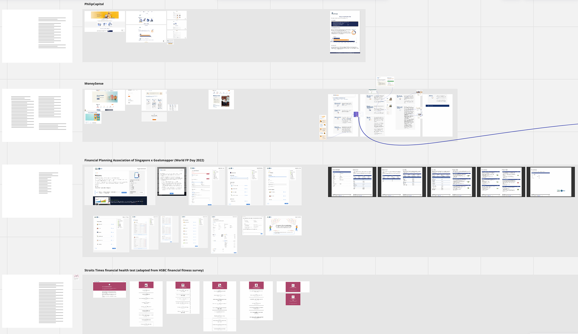
Financial reports by PhillipCapital, MyMoneySense, GoalsMapper, Straits Times/HSBC
User Research
One-on-one interviews provided qualitative and emotional insight into clients' experiences.
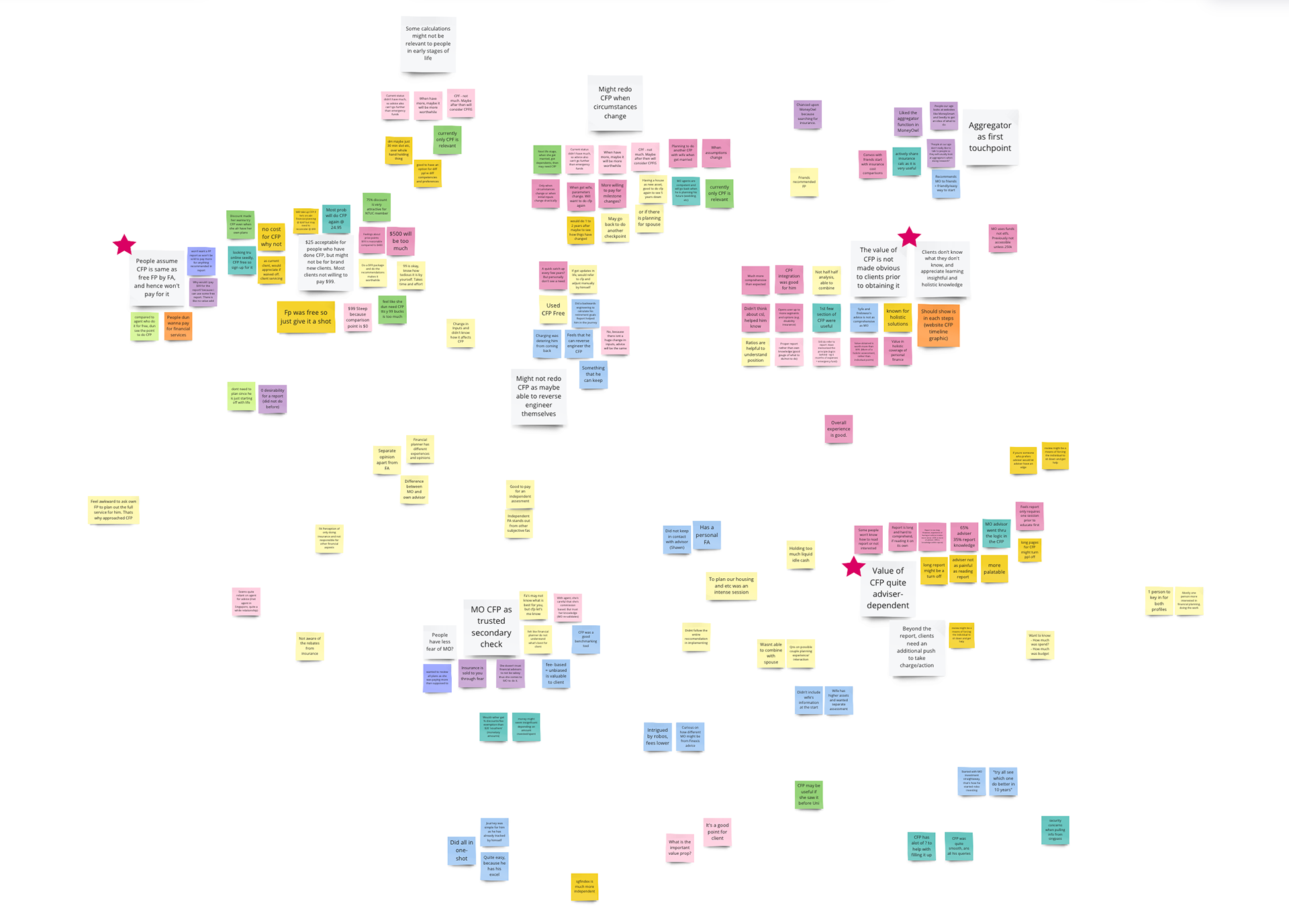
Key Insights:
1) Less useful by itself
Clients who had opted for consultations were more willing to pay as compared to those who only did the report. The latter felt that the report wasn't very useful and did not leave a strong or lasting impression.
2) Overwhelming & unclear information
Financial figures within the report were overwhelming, people only found some information meaningful. It was too wordy, resulting in confusion and loss of interest. Actionable recommendations were buried and unclear.
3) Just another financial report
MoneyOwl's report was often assumed to be similar to free financial reports by financial advisers and hence were less willing to pay for it. The report's true value was not expressed in a way that could be readily appreciated by current and potential clients.
Opportunity
How might we design an engaging feature that makes it simple for clients to understand, act on and revisit their financial report's insights without needing help from advisers?
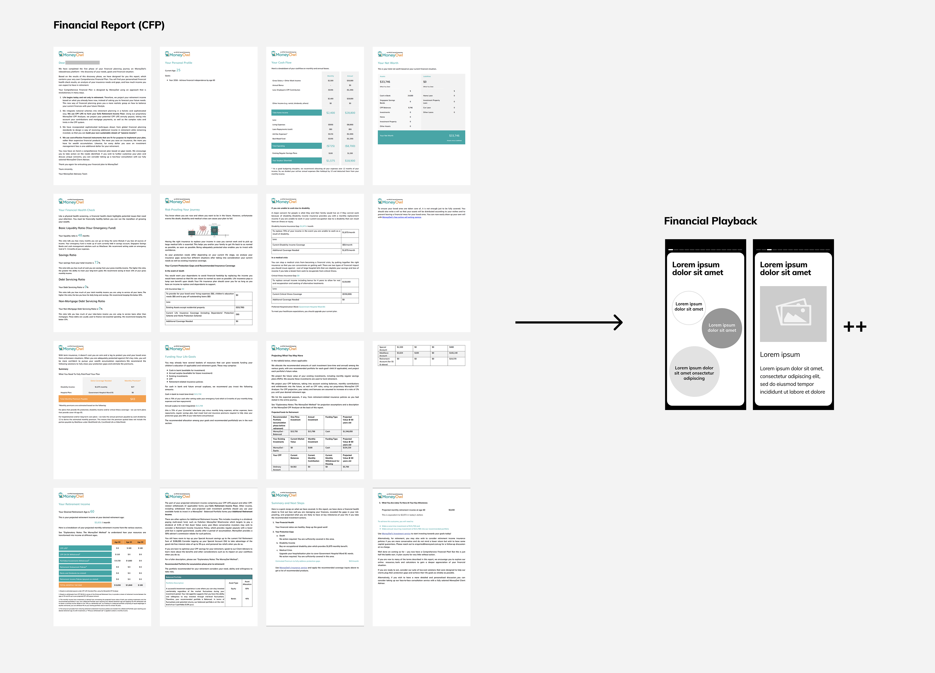
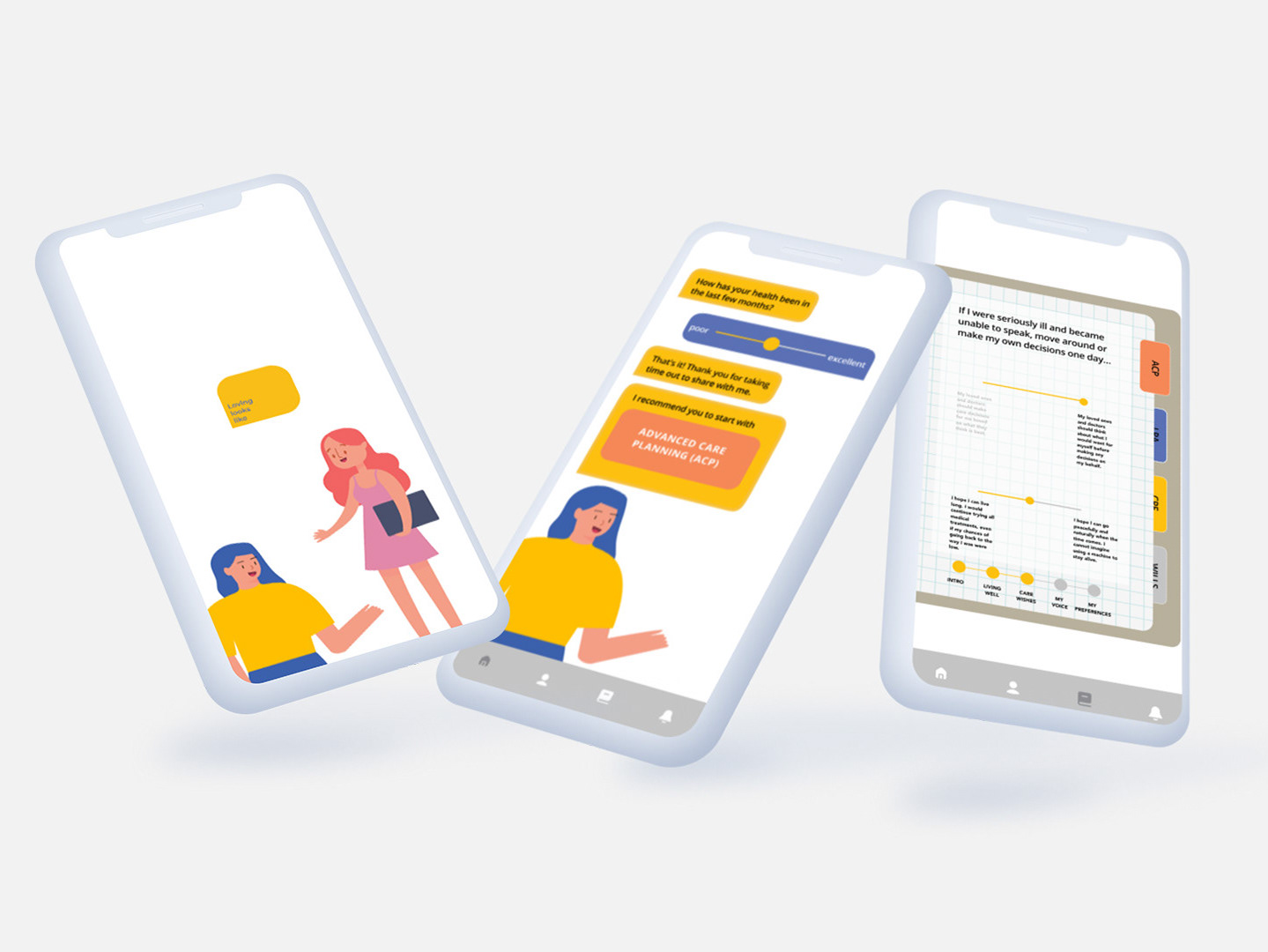
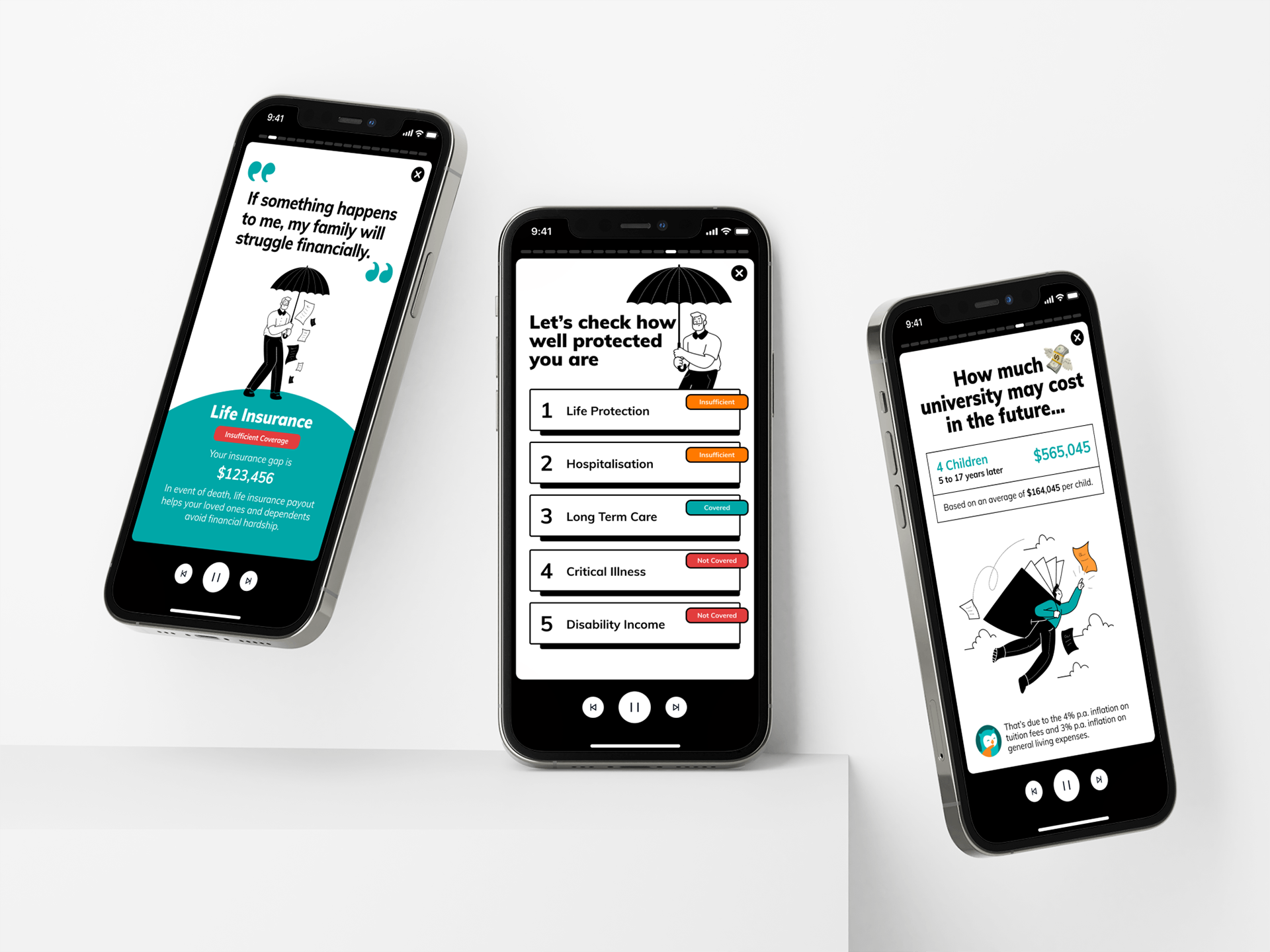
PlayBack: A supplementary feature comprising of a series of insightful & engaging content extracted from the report, presented in an interactive story-like format.
Best-in-class
I dove into breaking apart and analyzing the different platforms which used story-like features. It was quite eye-opening to see the plethora of ways in which content and styles were curated to fit the contexts, audiences, and purposes of each brand. Features such as insight personalization, interactive functions, and the incorporation of narratives were just a few aspects that stood out and have potential to keep users engaged while allowing one to gain new knowledge.
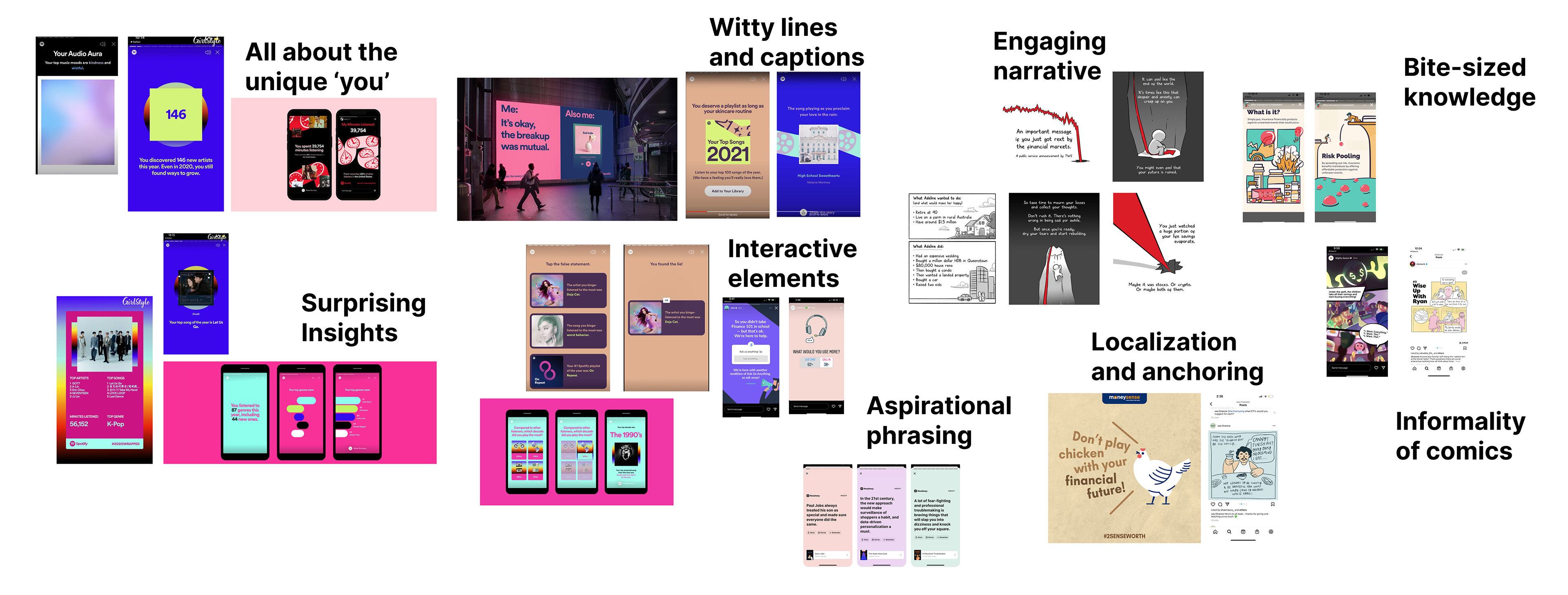
Inspiration board: Woke Salary Man, Spotify Playback, Instagram polls, Bubblegum, MoneySense, Headspace, etc
Content Audit
I sifted through the report and extracted the key insights within the report. Thereafter I came up with relatable alternative phrasings and framings of the content such that any insights users encountered would be as intuitive as possible and would ideally make sense immediately. Some key considerations were:
Comprehension : Words and data should easily understandable by non-financially savvy persons
Purpose : Content should be minimal and bring meaning and be useful to users
Emotion : To ensure a lasting impression, should the insight instil a sense of fear or hope in users?

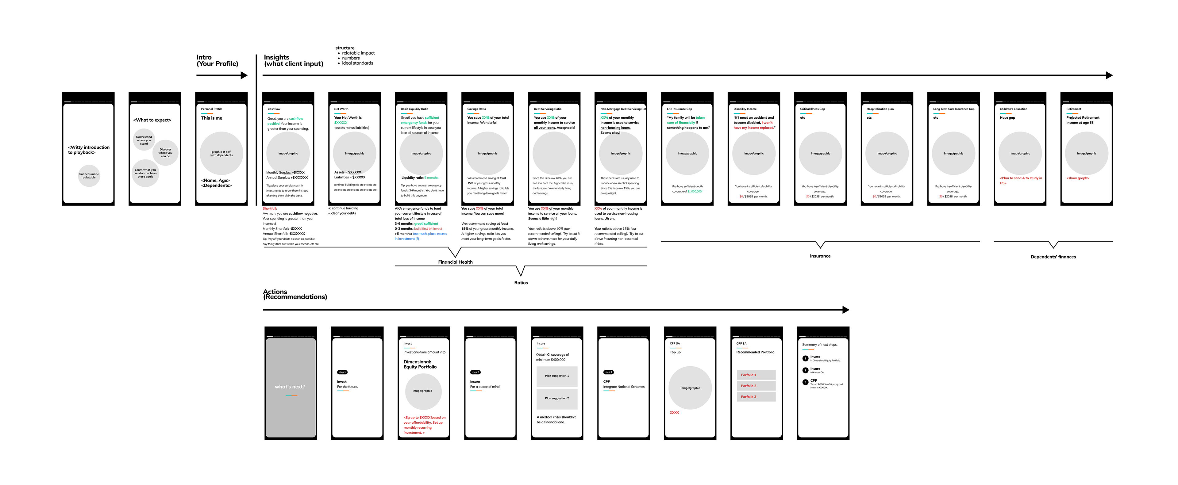
Initial Restructuring
I reimagined how the report's content could be structured in a linear flow, with an attempt to create a clear separation between categories and yet a smooth transition overall. After discussing with the team, some suggestions were made:
- To limit total number of screens to about 15 so as to not overwhelm
- To only show the most relevant insights
- To minimize the content fitted within each screen (should be able to view within 5-10 seconds)
Ideation: Incorporating New Elements
Looking at the Best-in-class examples inspired us to consider the addition of new, exciting content and insights into PlayBack, we it from our existing products or generating new content to engage our users.
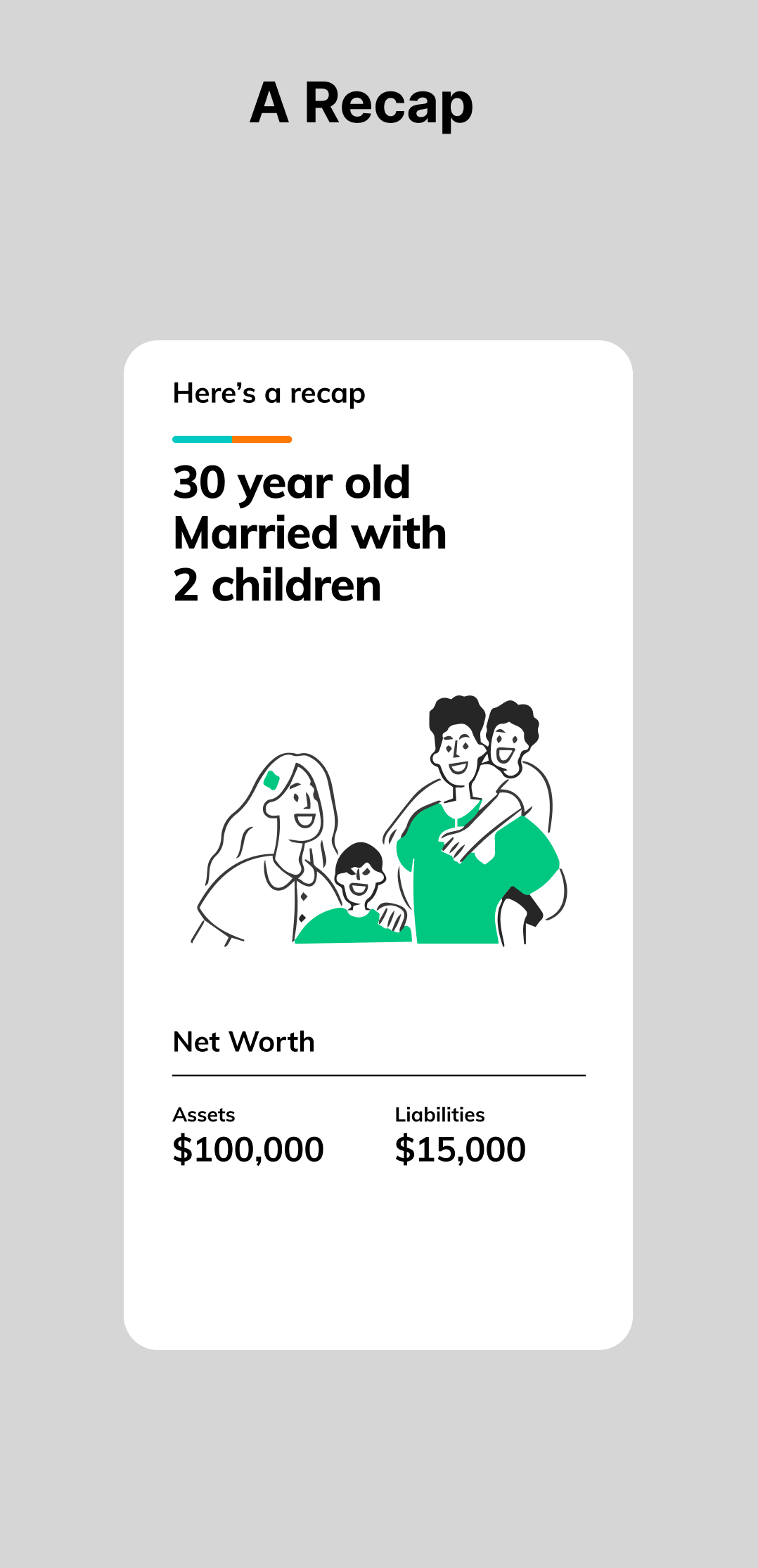
Annual Recap
Ideally, we would want people to complete our report yearly so as to get a refreshed & updated picture of their financial health and to keep track of their goals. Having an automated annual report generated yearly (which clients can view freely) could help clients see their progress over the year, relook at their fiancial standing, and make the necessary adjustments to reach their goals.
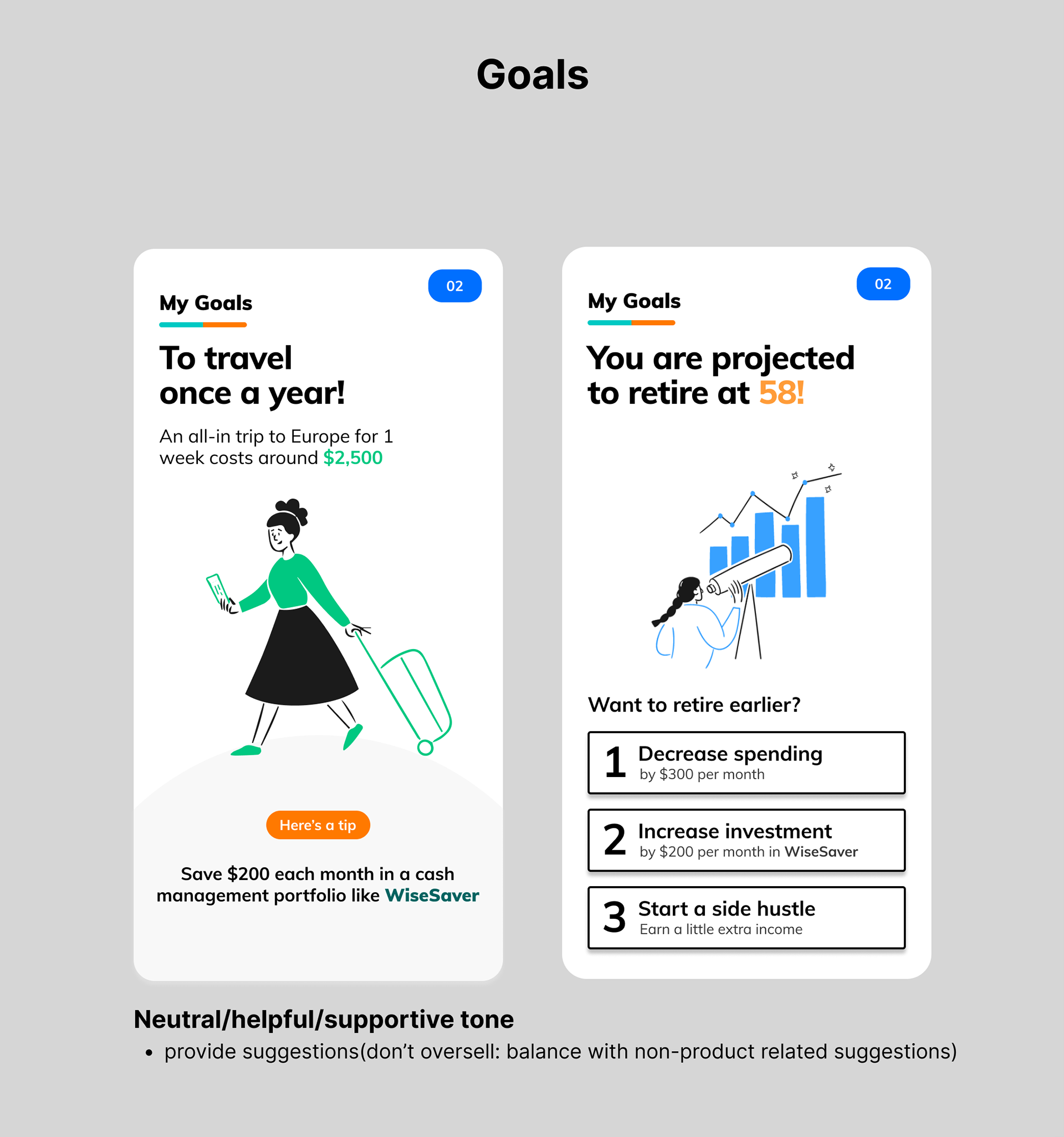
My Goals
Allowing users to put in their goals, and generating generic insights and advice based on those goals could give users the push they need to start managing their money actively. Advice could range from providing the average amount needed for a goal based on statistics, or providing broad and creative suggestions for the user to achieve their goals.
Insights from our products (investments, etc)
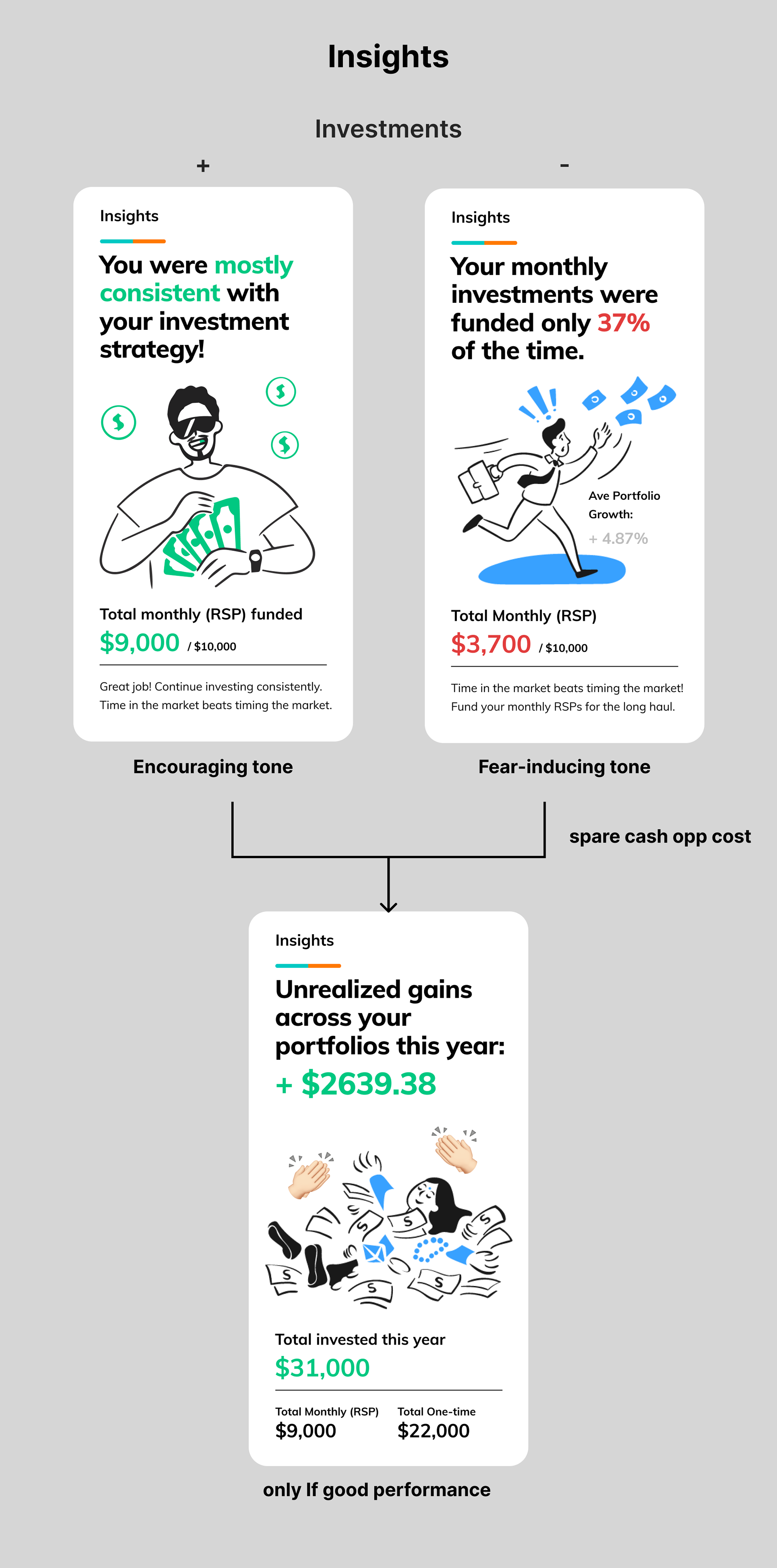
Giving users insights on their overall investment performance and habits could encourage users to keep certain good habits (like investing early, investing consistently), and kick some bad ones (like trying to time the market, being inconsistent). Users can also better understand their portfolios' performances at a glance. We also had to consider possible scenarios and implications: navigating the limits to negativity (should we show losses? how sensitive should we be about it?) as well as positivity (would good feedback give overconfidence? will this lead to bad choices down the road?).
Economic Outlook
Beyond one's own finances, we thought it would be beneficial to share financial happenings around the world that affect us, as well as financial analytics that we usually already share in our webinars and articles. This could help us maintain our image of relevance and reliability.
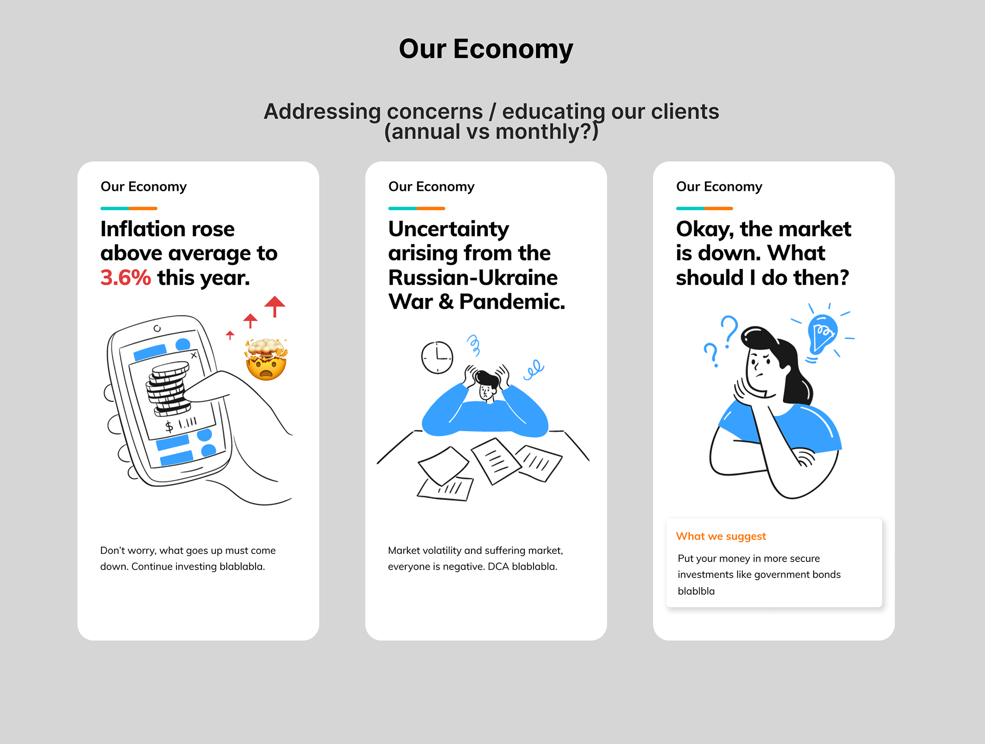
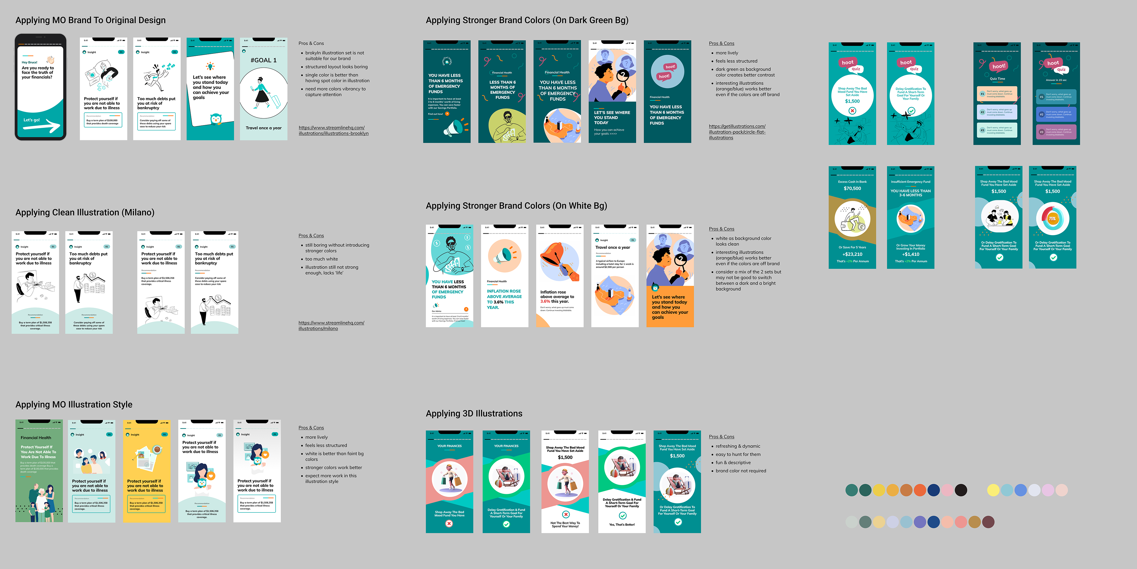
Illustration & Content Style
We explored various styles of illustration, UX copy, flow and interactions to see which suited our existing branding, yet provided a refreshing, light-hearted and clear vibe and tone.
Finding A Home
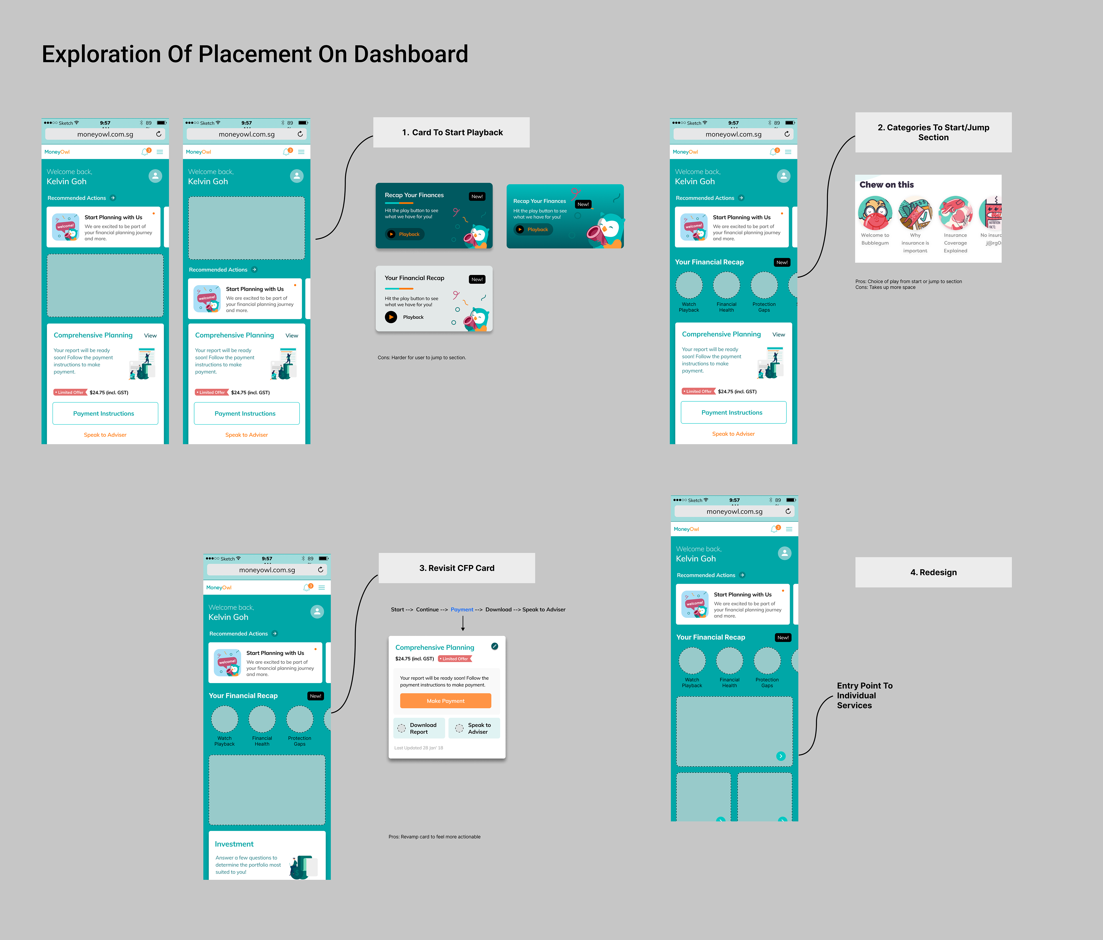
We explored ways in which the PlayBack feature could be incorporated into MoneyOwl's dashboard and existing information architecture. We could either create a new section for it, or incorporate it into the existing comprehensive financial report card.
Final Outcome
After several prototypes, feedback and iterations, we designed the final screens for PlayBack.
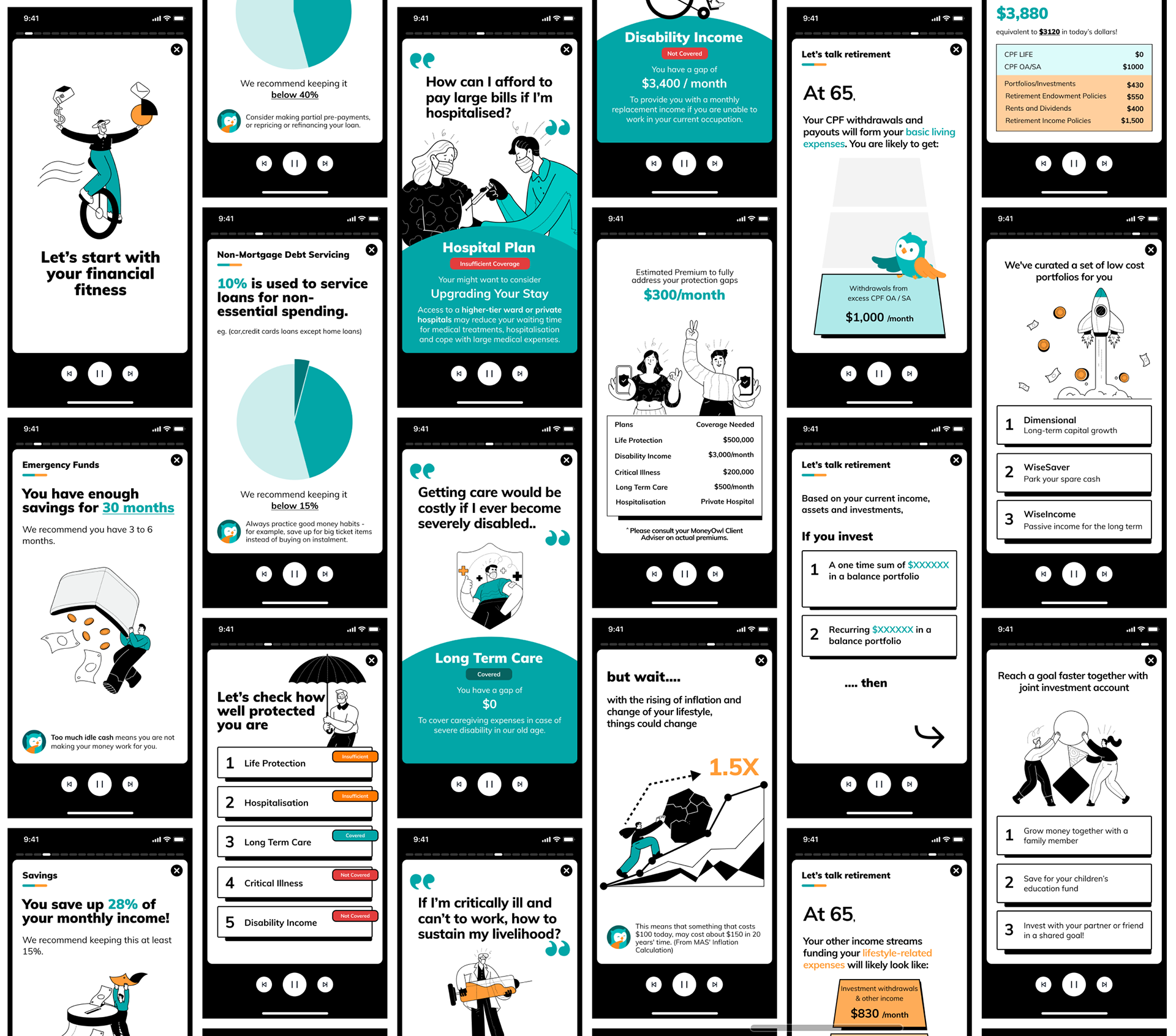
A Simplified Report
PlayBack provides useful insights that are clear and simple, yet let users understanding and appreciate the depth of analysis and value of report. Minimal jargon, with language and structure easily understandable by the layman.
Engaging Format
Only the most relevant information is shared with visualisation through illustrations to ease cognitive load (removal of cashflow & net worth, long explanations). Users can pick only the sections they are interested in, and can control the speed and order of report.
Independent Usage
PlayBack is not reliant on adviser for interpretation, user can take action more confidently as they have a better grasp of their financial health. The system opens up opportunities for future use cases (eg. adding in other components due to modular nature, usage for other products using the same structure)
Please try out the figma prototype below by expanding the window using the button on the top right corner :)
Looking Ahead
- Perhaps we might want to consider a generic version of PlayBack based on a set of imaginary data as part of onboarding process. This could let clients have a sneak peek into what CFP can offer, its relevance and usefulness.
- Due to time, data, financial, technical limitations, we were unable to explore different dynamic features like unique interactions (animations, know-yourself quizzes, etc) and personalization (financial personality, top 3 habits, AI generation). If we manage to secure more resources in the future, perhaps we could explore these areas to sustain user attention and relevance.
- Even with PlayBack as a simplified version of the report, all these insights might still be too much for some clients. Perhaps then we could provide alternative reports that only generate specific insights depending on user's interests level or life stage (eg. only financial health & investment recommendations for individuals more interested in growing their assets)